Monday, October 31, 2011
Friday, October 28, 2011
Thursday, October 27, 2011
Come as you aren't
I'm all for dressing up but maybe it's as easy as a mask and some awesome lighting for Halloween this year.
Wednesday, October 26, 2011
Tuesday, October 25, 2011
Monday, October 24, 2011
Friday, October 21, 2011
Thursday, October 20, 2011
More from Kalon Studios
These are rad. Hut Hut stools from Kalon for $125. The can be used a couple different ways and rock back and forth promoting balance for kids.
Wednesday, October 19, 2011
City Stop: Seattle
 |
| The dahlias at Pike's Market were insane - these huge arrangements for only $5, $10 or $15 |
 |
| The window display at All Saints is so clever - vintage sewing machines displayed in rows that rise almost 10ft vertically |
 |
| Neat interiors at the restaurant where we ate brunch |
 |
| I'm on a Boat! |
 |
| Do you think they sell these in the Neiman Marcus Christmas Catalogue? I really want one customized. |
Went to Seattle. Stayed Here. Ate here and here. Took this tour. Witnessed this slaughtering - I guess we are still rebuilding. Need to go back to the city for a more design oriented trip.
Tuesday, October 18, 2011
Monday, October 17, 2011
Hudson Baby Design: Sailing Away in Lone Tree, CO
 |
| A before shot of the room |
One of our latest nursery projects is finished! We just completed a very soft and soothing nursery for a baby boy in Lone Tree, CO. The room was inspired by some folk art paintings the couple owned (see below) that became our jumping off point for a casual nautical theme. First thing we did was paint - that completely transformed the room and did wonders to lighten up the space. A light blue color went on the ceiling and the walls received a creamy white, this helped to accentuate the moldings and height of the ceiling. This was one of the larger rooms we have worked in which allowed us to go up a size for the dresser/changing table area thus providing coveted counter space. Next to that is a comfy glider and convienant foot stool with hidden storage.
 |
| The two folk art paintings on the right provided the inspiration for the room |
A pair of nautical sconces went in on either side of the crib allowing for adjustable lighting options for the new parents. The painting above the crib was a last minute find that ended up being the perfect fit!
A soft, flat weave cotton rug in cream and blue was layered on the carpet.
The window treatments are where we brought in some color with a fun bright yellow chevron pattern used on the roman shades and at the base of the drapes for the large window.
This fantastic bookshelf is actually a converted shipping container! It's a totally unique piece that really pops against the creamy walls and was a spot where personal items could be incorporated into the room. We are so pleased with how this turned out and really enjoyed working with the parents to be, we can't wait to meet baby boy!
Thursday, October 13, 2011
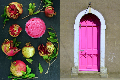
Pink Portal
Pink is everywhere it being October and Breast Cancer Awareness Month. For our own little tribute: a series of one of my all time favorite accents - the pink front door! Oh, to have the balls to execute this in real life.
Subscribe to:
Comments (Atom)


